
Lean Food Co.
Food delivery app for the active professional
Reading time: 5 minutes
Project Intro
This was the first project that I worked on after starting my UX Design Immersive course with General Assembly in London. The project is about designing a mobile app to solve a simple user problem for a fellow student.
Type: Solo Concept Project
Duration: 1 week + 1week
My Role: All project aspects, from user research to the high-fidelity prototype
Platform: Mobile app
UX Tools: User Interviews | Experience Map | Storyboarading | User Journey | User Flow | Pencil & Paper | Wireframing | Usability Testing
Software Tools: Marvel | Adobe Photoshop | Sketch | Craft | InVision | Keynote
Background
I was assigned a student partner to work with for the entire week and my tasks were:
- Interview my partner about his needs and desires around a chosen theme
- Identify a simple problem that could be solved through the synthesis of my research
- Design an app for my partner to solve in an effective manner the problem identified through my research
The Challenge
The expected deliverables for this project can be summarised as follow:
- User research, Experience Map, User Journey
- Storyboard, User Flow
- Paper Prototype, UI/Visual Design, Hi-Fi Interactive Prototype
The Process
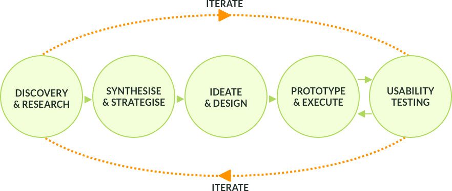
My UX process follows an iterative path and can be represented in several different ways. Adaptability is key to the digital world that is constantly evolving and changing and my objective is to deliver incremental value to a product or a service.
Week #1
From UX research to Marvel paper prototype
Phase 1 — Discovery
User Interview
Leading with empathy means to be able to put yourself in the users’ situation, feel their pain and frustrations, as well as understand their objectives and motivations.
I interviewed Sam, who was intended to represent the “persona” for whom the app had to be designed for.
Phase 2 — Synthesise
Pain Points
“I get frustrated when I cannot decide what to get at the grocery shop”
“I get irritated if I cannot find items or if I don’t know where they are”
“I get annoyed if I have to queue too long at the till or have to pay cash”
Motivations
“It would be good if I could get my grocery delivered at my doorstep”
“I do watch what I eat […], calories ingredients, fat content, etc.”
“It is nice when they offer you to try something new for free”
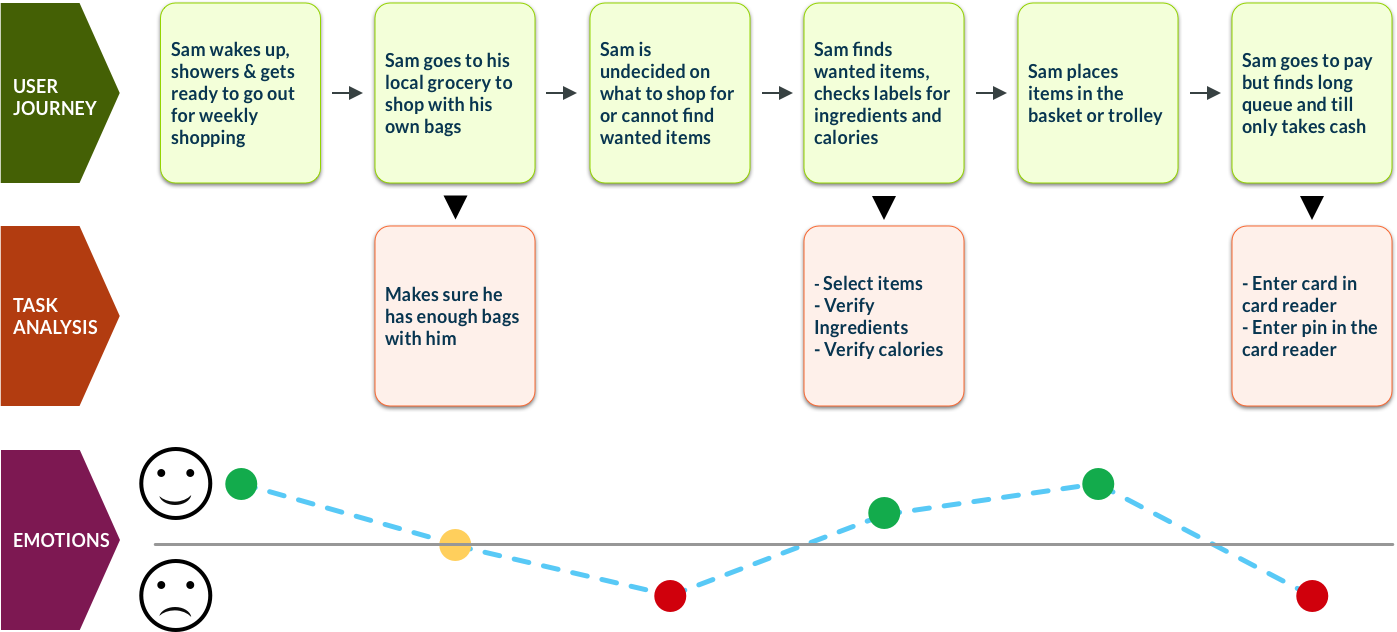
Experience Map
I used the Experience Map to imagine how Sam goes through his journey, what actions he needs to take to achieve his objectives and how his emotional state is during the whole process.
Phase 3 — Ideate
Storyboarding
I imagined how Sam would go about in his journey to get his groceries, so to visualise the key concepts I sketched a storyboard.
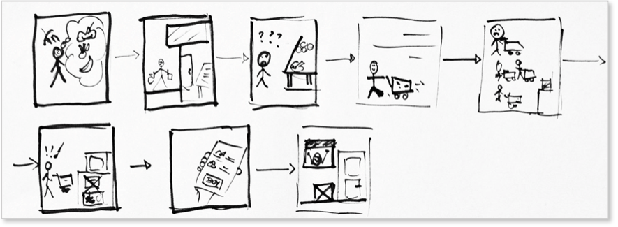
Outcome Statement
The storyboard helped me to pinpoint the problem and generate an outcome statement:
Situation: Sam needs to do his weekly grocery shopping
Problem: When Sam goes to the local store he is undecided on what to buy and at the till the queue is too long or only cash is accepted
Solution: By using the app, Sam can buy predifined grocery boxes online, check content details and book a slot for delivery
Outcome: Sam can now get his weekly grocery shopping deliverd to his doorstep and receive a chosen free sample
User Flow & Sketches
From the outcome statement in order to visualise what Sam would see and do with the app I had in mind, I created the user flow and sketched the wireframes:
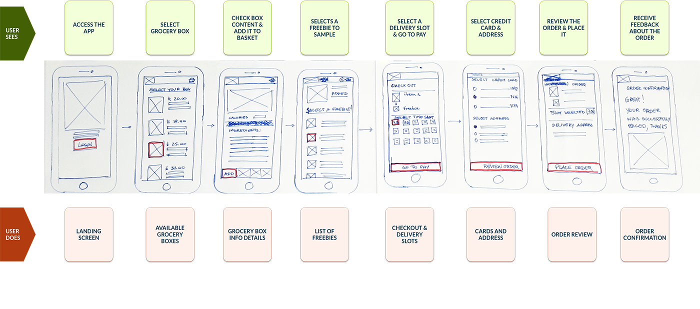
Phase 4 – Prototyping
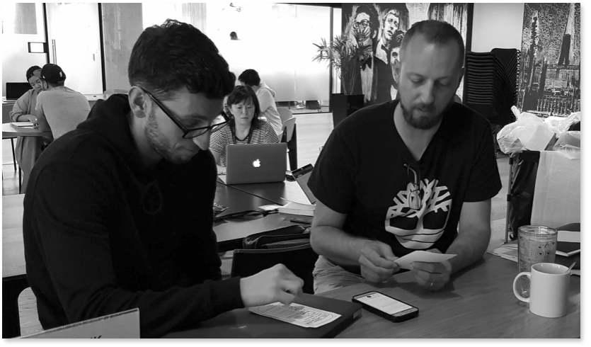
Usability Testing
My paper prototype was tested with 4 users, and the tests highlighted the following usability issues:
- All users were confused about the delivery time-slot in the checkout screen
- Payment screen was missing the button to review the order
- In the box details screens, 2 users did not understand what the ingredients meant
This important feedback was then used for further improving my design solution.
Week #2
From paper prototype to UI Design and full interactive prototype
UI Design week started 2 weeks after the completion of the first part of the work. Before diving into the visuals, I ported the paper prototype created in the first week to a greyscale Mid-Fi mock-up.
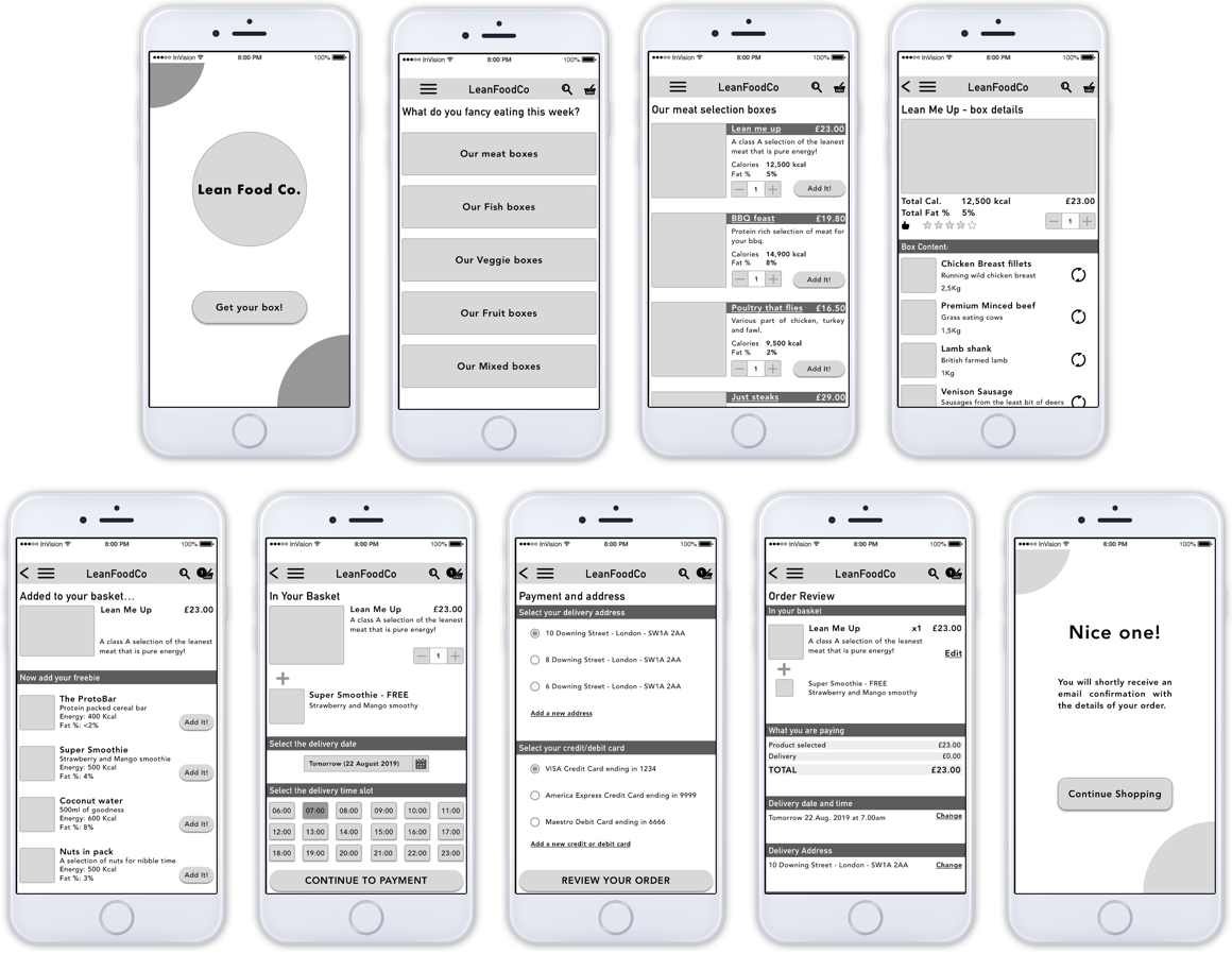
While working on the Mid-Fi I realised that there were changes that I could do to further enhance my solution. I also did some additional usability testing with 4 users and implemented all the relevant changes in my prototype.
User Interface & Visual Design
I carried out a full study for the UI Design to define the brand.
I started with the brand personality, based on Sam’s personality: he is an active young man, one of the traits that I wanted the brand to reflect was energetic.
Sam’s health consciousness pops into my mind the adjective balanced, and his cheeky and friendly personality throws also humorous and sense of belonging.
His openness to try new foods reminded me of exploration.
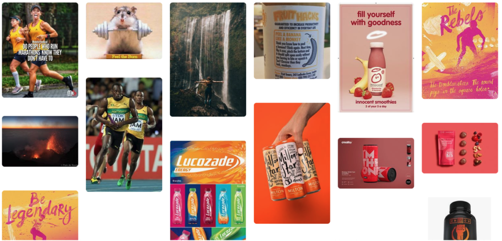
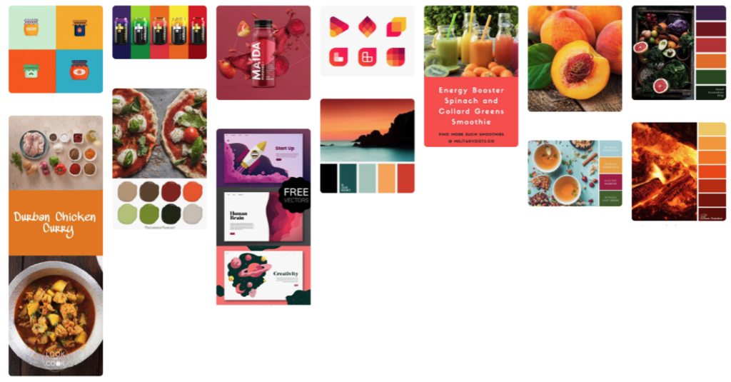
For the branding study I then analysed the brand positioning, brand affinity and voice statement. and I created a number of moodboards.
Branding Positioning
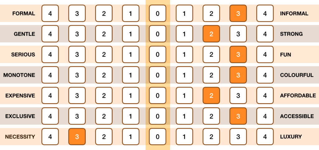
Feelings Moodboard
Brand Affinity
Colours Moodboard
Solution
A fully working Hi-Fi prototype was the result of my 2-week effort. During my presentation to my student peers my project was well received.
After the course I spent some more time to improve the visuals, limiting the palette to a single hue and giving it better way to select the food boxes.
Achievements
- Sam would be able to comfortably order pre-set boxes of grocery from his mobile phone
- The boxes are delivered at his home address on a date and time that is convenient to him
- Sam would be able to experiment with new food by selecting a freebie available with each box
- All payments are done via electronic means (no cash involved)
Future Considerations
- A proper study for the logo should be done, as the current is rather basic
- Provide the user with the possibility to customise the box content
Learnings
Designing an app around a single individual (as per project request) is rather limiting and taught me straight away that, as a UX Designer, I must search a wider number of participants to both assess user needs and help with the testing.
Personal bias and assumptions were probably the most challenging issues to overcome and at the end result, although functional, could have benefited from a slightly longer time-frame, with additional research done on competitors and the visuals design.
Do you like what you’ve seen? Contact me on mg.uxdesign@gmail.com