Jimmy Tendency
Responsive website for hairdresser salon
Reading Time: 5 minutes
Project intro
Jimmy Tendency is an Italian hairdresser salon that was successfully in business for over twenty years.
Gimmi, the business owner, asked me to redesign the entire website.
The website was live until March 2022, however after the COVID-19 pandemic, circumstances changed and the business ceased to exist as of April 2022.
Type: Solo — Client Project
My Role: Full-stack UX/UI and software implementation.
Platform: Responsive website
UX Tools: Pencil & Paper | User Interviews | Competitive Analysis | Contextual Inquiry | User Flow | Wireframing | Usability Testing
Software Design Tools: Photoshop | Sketch | InVision Studio
Development Tools: WordPress | CSS3 | HTML5 | JavasScript
The Challenge
I’ve known Gimmi for a very long time and he asked me to update his website. The old solution was not designed for portable devices, lacked proper visual communication and looked rather outdated.
Most of Gimmi’s clients use a smartphone to access the web, so he wanted the new solution to be responsive and include the following features:
- have an easy way to contact the hairdresser salon
- show a list of the product brands used at the shop
- provide the list of the services offered at the salon
- display links and social media presence
For new customers the website would need to display some additional information about the salon and a map showing how to get to the shop location.
The Process
For Jimmy Tendency website, as for most of my projects, I followed the British Design Council Double Diamond design process.
1. Discover: Research
Current usability
Once created the initial requirements from Gimmi, I started my research by testing and analysing the current website.
Key findings
While there seems to be some level of information hierarchy in the current version, no user research was conducted and user needs were not taken into consideration.
The general look & feel, typography, and colours were arbitrarily chosen and were not reflecting the business core values, while little consideration was given to usability and accessibility.
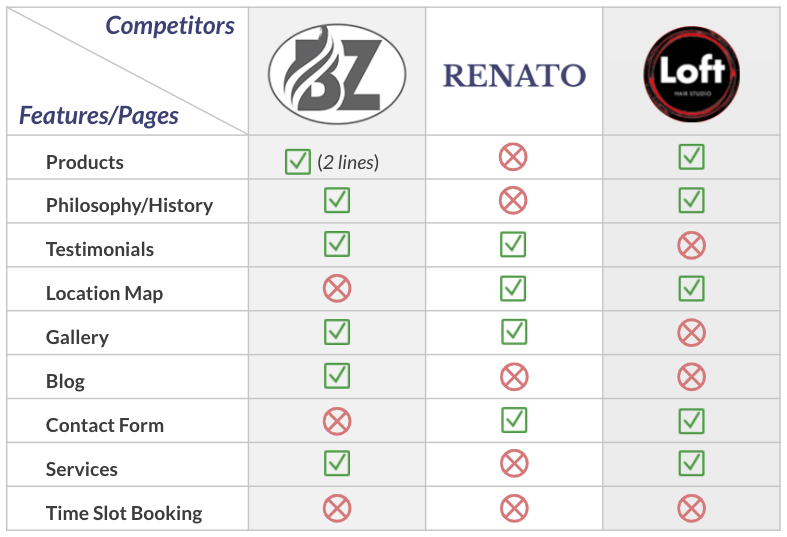
Competitive Analysis
I started with four user interviews, in person and over the phone, and I performed a quick competitive analysis.
The data collected informed me on how to approach the design solution and helped me to determine the user needs, objectives and frustrations.
User Interviews
I conducted interviews with 5 people, 3 existing clients and 2 others who agreed to talk about the salon and the way that they access the Web.
2. Define: Research Synthesis
According to my user research, the 3 main key findings were:
- Users visit the website for getting in touch with the salon staff
- They need to check the opening times
- Users would like to be able to book an appointment and fix a time slot.
Here are some other comments that I was able to get through my research:
“If the website was available on the phone, I would certainly be checking it out regularly”
“A couple of times it was difficult to get access through the landline, and it would be nice to send Gimmi an instant message through WhatsApp to book an appointment.”
“It would be nice to see a gallery with photos with Gimmi’s and his team’s work, so to get inspired!”
Persona
From my research, I decided to create a user persona, Paola, and this helped me and Gimmi to have a better understanding of the users’ motivations and pain points.
Paola, 36, shop assistant
Bio: She is a busy mother of one and she works as shop assistant in the local shopping centre
Pain Points:
- Cannot check the website on my phone on the go, and I have to use laptop
- Don’t know when the salon has a free slot
- Being unable to call in to book an appointment (no answer on the phone; landline not working)
Motivations:
- Would like to book an appointment online using her smartphone
- She loves the familiar and informal atmosphere at the shop
- Many family commitments, so she needs to plan the week ahead
3. Develop: ideate
After speaking to Gimmi, we agreed upon creating a clean, feminine and minimalistic design, in line with Jimmy Tendency brand identity:

For my solution I had to take into account the tight budget and any technological constraints. I proposed to Gimmi a hosted CMS such as WordPress, since cost will be contained and a responsive implementation would have been straightforward.
I iterated with Gimmi throughout the whole UX Design and implementation process. We exchanged ideas and worked closely to achieve both the business objectives and to create added value for his clients within the given constraints.
4. Deliver: ideas implementation
Mid-fi wireframing
I created 6 mid-fi wireframes for the web version. This helped me to test the users’ and business’ needs as well as address their pain points.
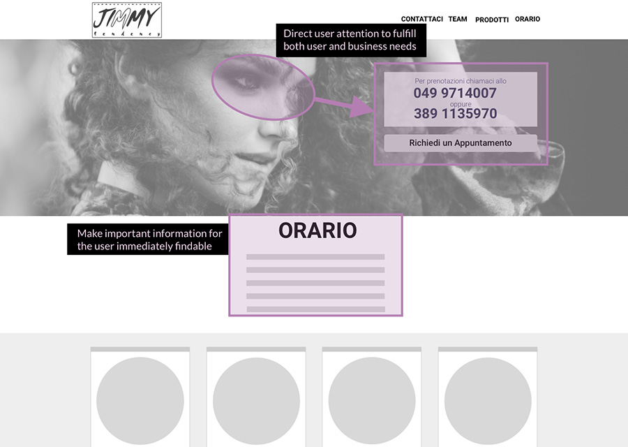
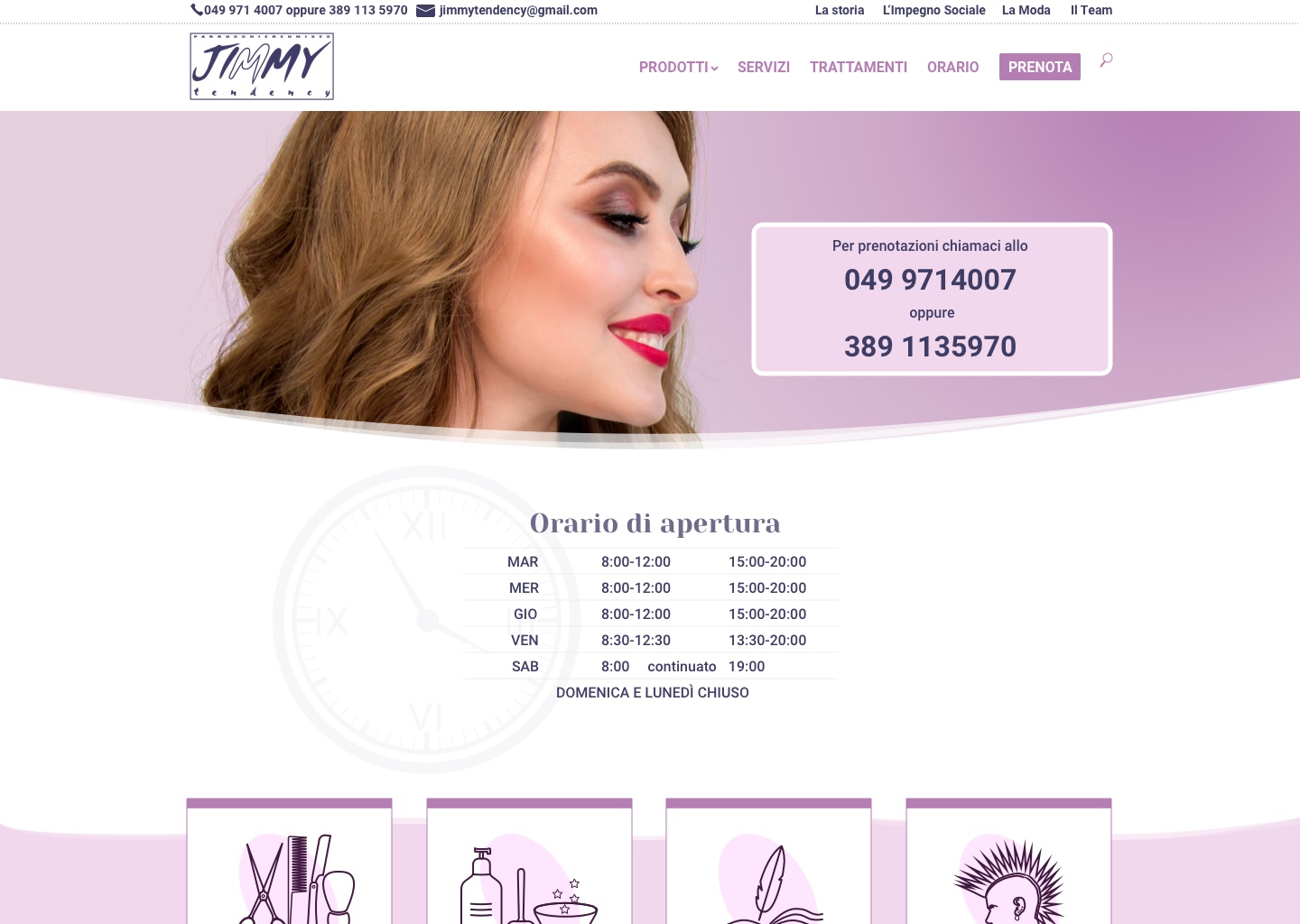
Here is an example of how the landing page and how I went about providing a solution for the opening hours and the business contact details:
Visual elements in UX Design should be used with purpose and not for decoration. To address one of the user needs, which happens to also be a business requirement, for the landing page I chose an image to direct user attention to the most relevant information: the salon telephone numbers. In this way I aimed to convey and reinforce a message as Visual elements in UX Design should be used with purpose and not just for decoration.
I conducted a user testing session with 3 people, and the response was overall very positive, and no major issues found.
Hi-fi wireframes – iteration #1
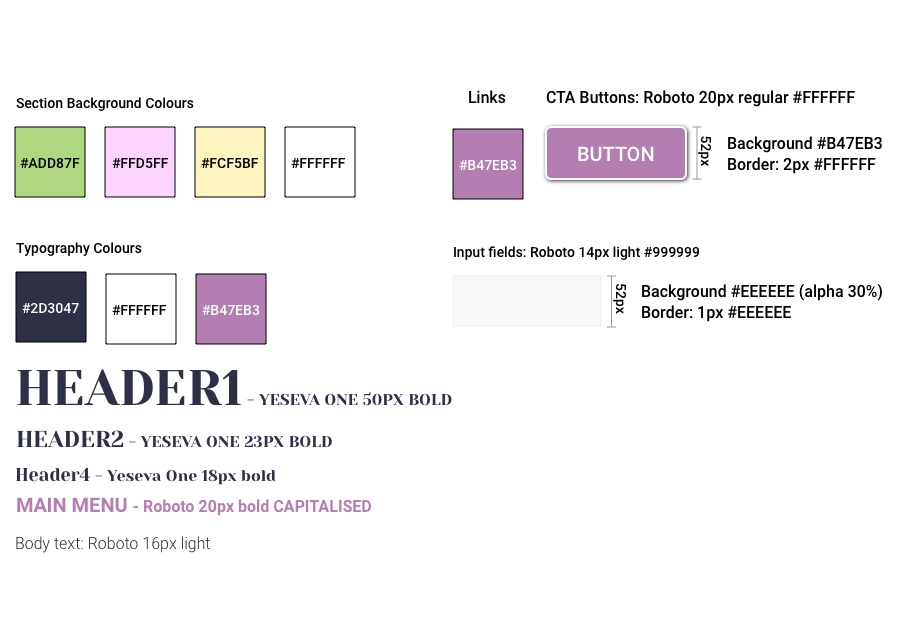
After addressing the issue found during the testing, I moved on to the hi-fi version and I proposed to Gimmi a triadic palette, as shown below:
Usability test feedback
After testing the initial design with 3 users, the feedback received was:
The image you used looks a bit too serious…
Why was the “Impegno Sociale” section moved to the homepage?
It’s nice, but perhaps you should stick to one colour, as there are already too many colours with the pictures
Shouldn’t the ‘book an appointment’ button be available from any page?
Hi-fi wireframes – iteration #2
Changes were clearly needed following these comments.
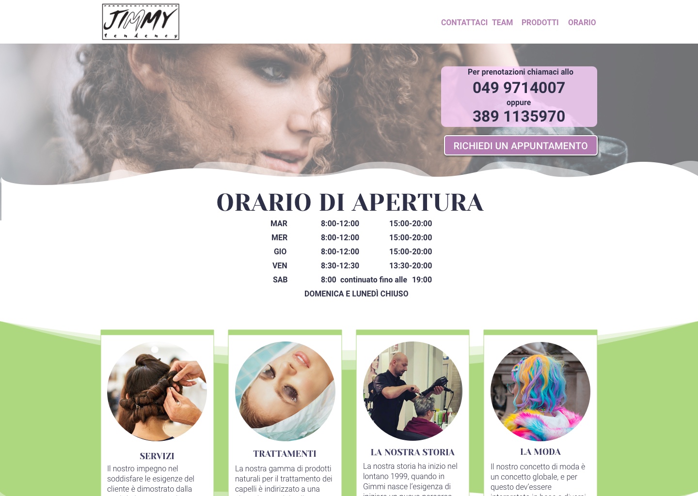
I chose with Gimmi an image with a woman showing a happier expression, so as to increase empathy, and reflect the positive and relaxing atmosphere of the salon.
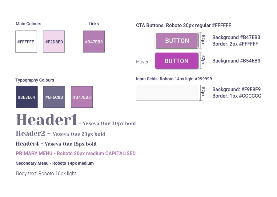
We changed the colours to a more sober analogous palette, to increase the clean and minimalist look, leaving very feminine shades of pink on a white background.
I ran another test with 3 users and this time their comments were very positive, and no major changes were required.
I love it! It is very simple to navigate and I like the menu at the top
It looks more harmonic without that green and yellow backgrounds
The content seems to be better organised in this new version
The next step was to move from the design phase to the software solution implementation.
Web implementation
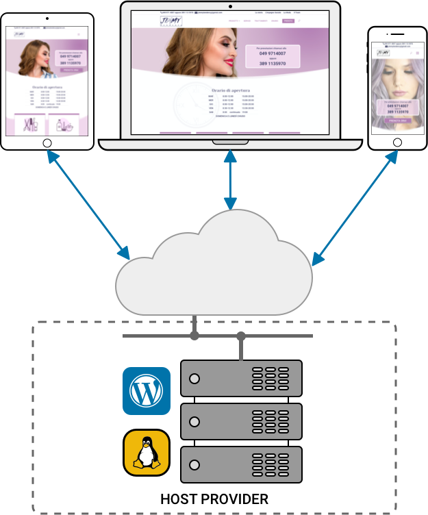
The existing website was hosted on a rather old Linux server. The old solution was a custom-made static PHP/MySQL implementation and the content wasn’t managed through a CMS, which makes changes and adding pages much faster.
Gimmi’s host provider supplies some good additional services, including a fully automated deployment of WordPress.
After installing WordPress, though, I realised that the host service needed to run on higher versions of PHP and MySQL. I contacted the provider on Gimmi’s behalf and I managed to migrate free of charge the site to new and more secure servers featuring SSL encryption.
A limited number of plugins were also added, and for some of them I had to customise their CSS to keep the look & feel consistent with my design.
The website went live in the middle of June 2020, just a few weeks after businesses reopened following the Covid-19 lockdown.
Solution & Release
Achievements
- The website can now be browsed from portable devices
- Clients can securely book an appointment through the contact form
- By using of Google reCAPTCHA, Gimmi has seen spam emails disappear
- Clients are able to instant chat to the salon staff WhatsApp channel
In addition, customers are able to browse the products offered by the salon and new clients can find details about the salon using the Google location map, while the website traffic can be monitored through Google Analytics.
Seeing Gimmi so happy after delivering my solution and receiving such positive feedback from his clients is what makes my job so worthwhile.
Next steps
Potential new features that can be added to the current release are:
- Integrate social media login (Facebook, Google and Twitter) to allow Gimmi sending marketing newsletter to his clients with product offerings and therefore increase his revenue.
- Add an appointment booking system to release staff from this task, while also making it possible for clients to make an appointment out of working hours.
- Evaluate the possibility of making the product available for sale through an e-commerce solution on the website.
Learnings
By choosing a powerful WordPress theme, rather than going with a standard template I could customise the whole site layout according to my design.
Despite being new new to this theme, the task was both challenging and very enjoyable, as I learnt a lot about the theme framework.
I also applied my CSS/JavaScript knowledge to customise various controls in the WordPress child theme to achieve a consistent look and feel throughout the website.

